Sidequest: Terrible Templating
Welcome to Sidequest, a sporadic column thing that will pop up when there are things that I want to “discuss” (read: rant about), but don’t deserve an entire fully-fledged article. Expect semi-coherent ramblings, a reasonable amount of F-bombs, and just whatever came to mind at the time of writing.
Today’s topic is one that is very near and dear to me: templating and layout in card games. At the risk of sounding pretentious, I’m gonna say there’s a certain level of art to it. Not ‘you plebeians just don’t understand the artist’s brilliance’, but in the sense that it’s less of an exact science than it could/should be. You just have to do a lot of it to get good at it.
Look, it’s card games, not rocket science. Your goal for making a template should be finding a reasonable way to give specific information to the person reading it, and maybe making it look like something vaguely nice along the way. It’s not that hard, and it involves a lot more common sense than you might initially think.
Now, when said common sense isn’t present, you get things like this:
DO NOT. I REPEAT, DO NOT FUCKING DO THIS!
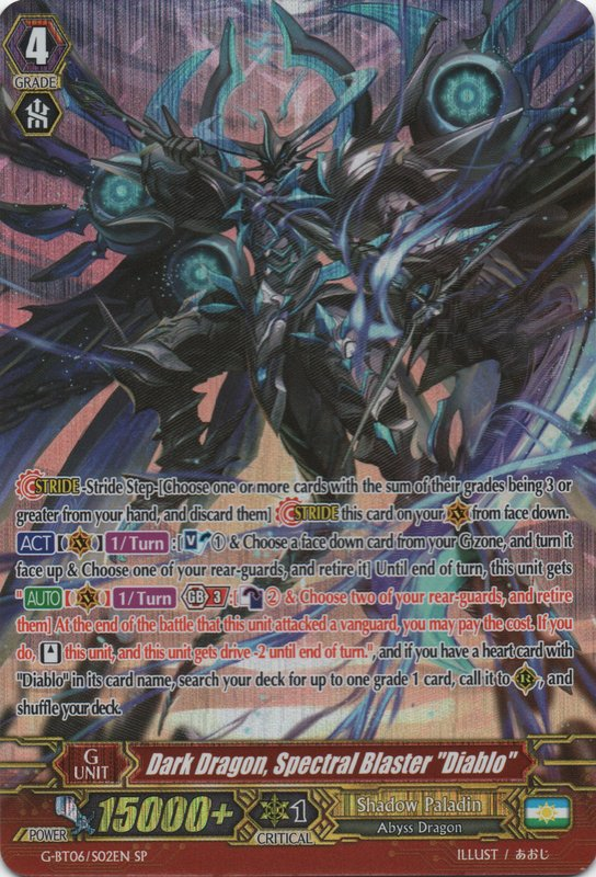
This absolute asinine aberration and affront to anyone’s eyes is from CARDFIGHT!! Vanguard, which somehow is actually the game’s proper name. Now, I don’t know jack shit about the game itself, but one doesn’t need to be a graphic design guru to see that this is a pretty terrible way to do that whole ‘convey important info’ thing.
When the card requires you to do a double-take to get a grasp of whatever the hell you’re looking at in the first place, that’s quite the red flag there. The clusterfuck of mid-text symbols doesn’t really help either, considering that’s still parsing overhead even if you properly know the rules. Speaking of flags, one has to wonder what’s the deal with the bootleg Argentinian flag bottom right. Another mystery for the ages, perhaps…
One thing this template does properly though, is showing us mere mortals how awesome red text with a white outline on top of very busy art looks. Blah, readable text is so passé.
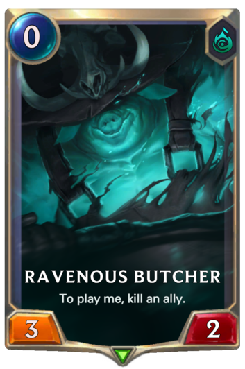
Crappy card #2. This time from the very new and shiny League of Legends of Runeterra. This one, fortunately, doesn’t repeat the mistakes of the Vanguard card above it. In fact, very few games do, and even then it’s usually on more promo-oriented templates and the like.
However, this one has an issue coming in from a completely different, but nevertheless important angle. Now, since this is my article, you’re kinda stuck with my opinion. And my opinion is that whoever the fuck thought it was a good idea to have cards refer to themselves in the first person is a moron. I can already see the hipsters designers responsible for this, sat around the official™ design table, discussing how one can shit on all standards for card readability and parsing. Now, my first real foray into card games was MtG, and that game’s templating is a complete 180° turn from this with how rigid, polished, and—at times—sterile the wording feels. But MtG is a game that knows that ambiguity is a cardinal sin in card games, considering pretty much all card effects technically break/change the game’s rules in one way or another.
Seeing Runeterra’s approach to wording was a pretty big shock to me, with other gems aside from the egomaniacal egocentric ‘It seems our cards have somehow achieved sentience.’ wording. For another potential wording mess, ‘Deal 1 to anything’ comes to mind. Now, sure, you can make the case that it’s not really ambiguous in that the only thing you can realistically deal is damage (if you say ‘but what about cards’, we’re not playing Legends of Blackjack here). But would it kill them to add ‘damage’ to the text? Oh wait, what the fuck am I talking about? It’s a digital card game! In the digital world, less (readable text) is more! (text hidden behind tooltips)
Now, it wouldn’t be fair to shit on other card games and not mention some of the absurd stuff the OG does. You didn’t think I’d let Magic: the Gathering slip through this entire article without digging into it, did you?
Behold, one of the definitive answers to ‘how rigid is too rigid’ as far as wording in card games is concerned:
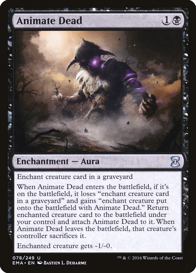
Ah, Animate Dead, one of the pinnacles of fucky MtG wording. The perfect combination of exact rules and precise wording has resulted in the creation of this abomination. Without explaining too much, the card can be summed up as ‘return a creature from your graveyard to the battlefield with this attached to it. If this is unattached, the creature dies. Oh, and it deals slightly less damage.’ But, modern MtG standards for wording dictate that this should be 10 lines of text, and the frame itself feels like it’s going to give way to this fat wall of mostly-meaningless Magic-ese any minute now. I’d honestly prefer a flow chart or something to this current implementation of things.
Though, MtG’s wording constantly evolves as the game goes on, and the image above shows the most recent version of that card. To show that newer doesn’t necessarily mean better, here’s the original version from 1993/4:

The old card, even with its quirks, is still somehow more coherent. But, every point has a counterpoint, and in this case, the counterpoint to ‘older can be be better’ is called Ice Cauldron:

To be fair, this is just one of those designs where no amount of wording polish can really salvage things. Remember kids, you’re writing card game text, not a word-by-word retelling of Tolstoy’s War and Peace.
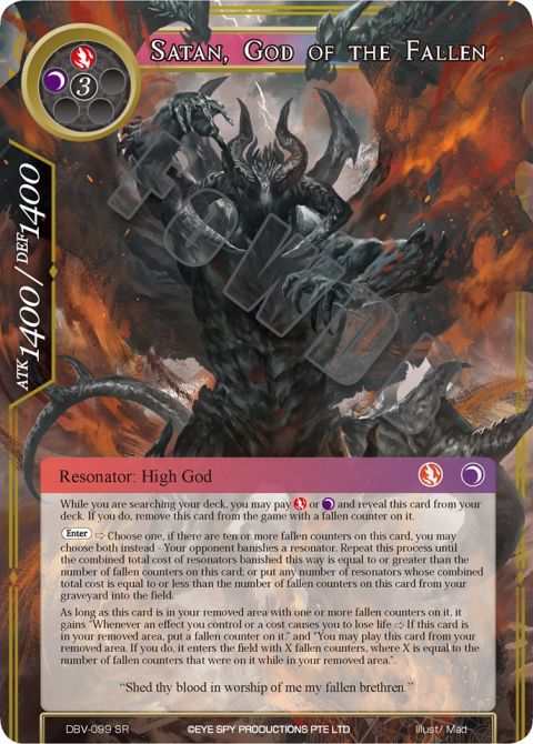
EDIT: Found this thing recently, courtesy of Force of Will TCG. Yes, this is a real card in that game, though initially it felt like I stumbled upon a custom card. Bet you can’t guess why…
Fuck. I thought this would be a short little rant-like thing, but apparently I have a lot to say on the matter. Fortunately, I’m gonna be cutting it short here. Even something as barely-coherent as this should still remain reasonable in length.
Next time… who knows? Sidequest isn’t really planned ahead, and the spontaneous nature of it is a major part of its appeal for me. I don’t think you should be surprised if the next title is something like 17 Reasons Why Dice-Based Combat Should Be Illegal.
Until that post comes, here’s something I pulled out of my closet the other day:
This is InvertedVertex, signing off.